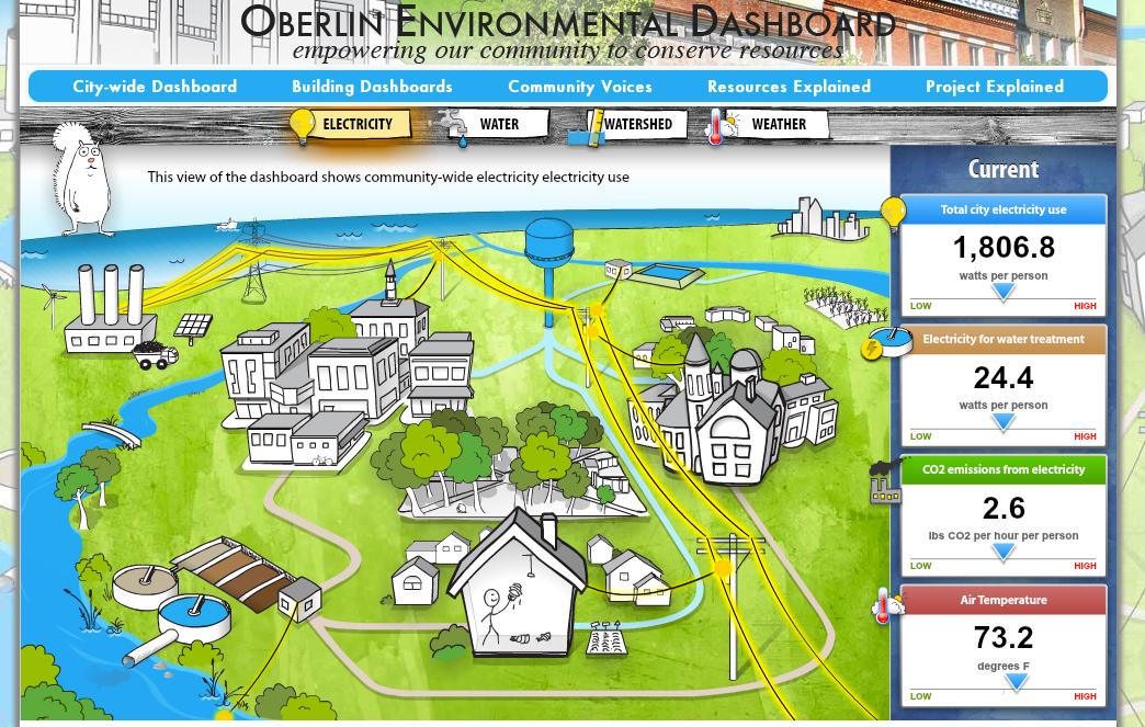
Ohio city of Oberlin debuts community-wide environmental dashboard
The Oberlin community-wide dashboard
The city of Oberlin, Ohio, is pioneering a new website that uses entertaining graphics to show the entire town’s electricity use, water flow, and even water quality — all in real time.
The developers call it the Oberlin Environmental Dashboard, and hope it will become a model for motivating community wide energy conservation, not just in Oberlin, but across the region. Jon Petersen, who teaches Environmental Studies at Oberlin College, is among the developers of the project.
Petersen said the goal of the dashboard was to take very complex, technical information and translate it into an accessible, easily understood presentation.
“We’re trying to create these sort of compelling animated graphics that convey to people in a way how their resource consumption is actually affecting the world around them,” he said.
The Oberlin project is out in front of a wave of projects designed to illustrate energy flows and energy uses. Especially over the past 10 years, the initiatives have really taken off. But Petersen insists his project is slightly different from these existing efforts.
“We’re trying to monitor not just resource flows in individual buildings, but resource flows at the whole community scale — as well as environmental quality,” he said.
If you load up the dashboard, you’re given the choice of looking at a city view, a view specific to an individual building.
“You’re looking at the freshwater treatment plant, the wastewater treatment plant, the electricity production facility, the river that drains our community,” he said. “And you’re watching electrons flow down power lines; you’re watching water flow down pipes.”
Because Oberlin is powered largely by coal, the power plant spews black smoke clouds every few seconds, a reminder of the impacts of power generation in the real world. But nearby are wind turbines and solar panels, indicative of how the energy mix is starting to change.
Clicking over to the water dashboard, the site presents information about water use, waste water processing and even the storage level of a local reservoir.
“If you look at that in the morning, you’re going to see high use because people are taking showers. There are times of day when our little bit of light industry within Oberlin is going to be using more water,” Petersen said.
The dashboard also shows individual electricity use, air quality, water quality — all indicators of community health.
So far, all the information has captivated parts of the community, Petersen said. Especially school children.
“We do actually see children as being central to this process,” he said. “Not just as recipients of information, but one of the things that we’re most excited about with environmental dashboard, is the community voices section where we’re taking images, and messages drawn from community members and displaying them to the community.”
Ultimately, Petersen is hoping the dashboard will help people to make decisions about their behaviors and alter them in a way that is more environmentally sustainable.
But in the short-term, the goal is merely to get people to engage with the dashboard, so they can make decisions, Petersen said, that are consistent with sustainable community life.
“We’re just as interested in having people think about how they are interacting with other community members, how they’re voting in local elections,” he said. “We want them to think about all of those things as they relate to resource use.”
Every day, reporters and producers at The World are hard at work bringing you human-centered news from across the globe. But we can’t do it without you. We need your support to ensure we can continue this work for another year.
Make a gift today, and you’ll help us unlock a matching gift of $67,000!
