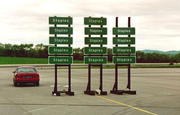
Why did people freak when US wanted to change font on highway signs?
In the 1990s, researchers from Penn State tested Clearview's legibility against Highway Gothic.
Last week, the US government made a big graphic design decision without much fanfare.
The Federal Highway Administration quietly withdrew its approval of Clearview, the typeface that’s been showing up on highway signs around the country over the past decade or so. In its place, the FHWA is bringing back Highway Gothic — a typeface that went unchanged for 60 years, and one whose legibility problems Clearview was designed to fix.
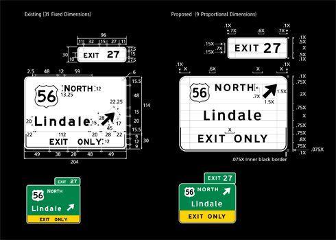
To understand why this is such a big deal, you have to go back to the 1950s. As the Eisenhower administration unveiled the interstate highway system, the government needed a standard typeface for its road signs. As graphic designer Don Meeker explained in a story about the design of road signs, Highway Gothic was based on a print lettering font, blown up to giant size.
“The astonishing thing is that [Highway Gothic] has lived for 58 years,” Meeker told us in 2011. “If computers were regulated like highway signs, we’d still be living with vacuum tubes.”
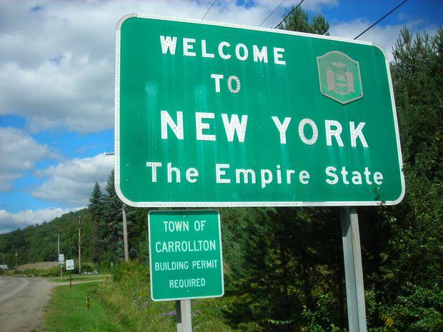
By the late 1980s, it was clear that Highway Gothic had problems. It was notorious for an effect known as “halation,” in which bright reflections turned letters into an illegible white blur at night.
As the driving population aged and baby boomers’ eyesight deteriorated, traffic engineers saw Highway Gothic’s halation as a potentially deadly design problem in need of a typographic solution.
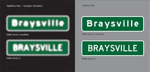
Meeker helped bring highway signs back into focus with Clearview. It eased the tight internal spaces of lowercase letters like “a” and “e,” which in Highway Gothic tended to trap light and look like “o”s at night. Clearview aimed to improve legibility, and it did, according to research conducted at Penn State and Texas A&M.
Clearview made signs easier to read at highway speeds from farther away, without having to increase the size of the letters or the signs themselves. Starting in 2004, roughly 30 states adopted the font.
So why is the FHWA putting Clearview in the rear view? According to CityLab, an FHWA spokesman cited unpublished research that calls Clearview’s legibility into question. But Meeker has calls this claim baloney.
“Helen Keller can tell you from the grave that Clearview looks better,” Meeker told CityLab. He suspects the about-face is personal. “This is a burr in somebody’s saddle,” he said, adding, “They don’t understand design.”
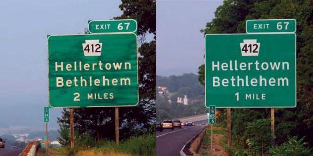
Still, even if this new policy holds, you’ve still got plenty of time to appreciate the glories of Clearview — it will be decades before all the signs bearing the new typeface get replaced. When that day comes, some fancier message boards may start tracking the last remaining examples of this once-promising innovation.
Create your own user feedback survey
This story was first published by Studio 360 with Kurt Andersen.
