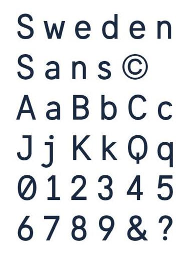
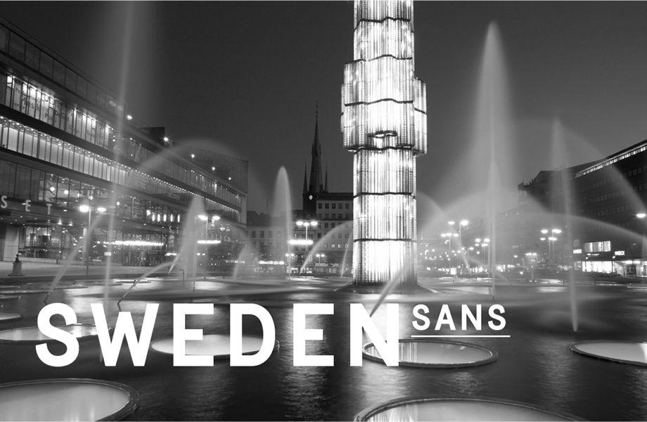
The font, Sweden Sans, was designed by Swedish agency Soderhavet in collaboration with Swedish type designer Stefan Hattenbach as part of a new national branding effort.
Plenty of countries have national birds, national anthems, national dishes — but a national font? There Sweden is almost all on its own.
Yes, Sweden recently introduced its own font, called Sweden Sans. The idea is that the new national font will replace the many fragmented styles that government agencies currently use.
"It's modern, yet designed to be long lasting," says Mattias Svensson, a creative director at Soderhavet, the design firm that created Sweden Sans. "In that way you can find maybe some inspiration in traditional Scandanavian design, which is clean, clear and open."

Svensson has some pretty high hopes for the font, saying it's meant to "raise awareness and interest, and to build trust in Sweden." He's hoping the font will capture people's attention leading them, eventually, to associate it closely with his country "and realize this is Sweden communicating."
Stefan Hattenbach, the type designer who worked with Soderhavet, describes Sweden Sans as a "very slick typeface. I would say … It looks very geometric and modern." He says the design was partly inspired by old Swedish signs that were popular in the 1950s and '60s.
"Sweden in the '50s and '60s was a very positive atmosphere and everything was looking great, so we felt that could be a good period for picking up ideas for the design," he says.
Hattenbach says he's quite happy with the way the whole alphabet came out, but he does have a favorite letter: "I do like the S, which is kind of a hard letter to make, actually. It can really fall off and look unbalanced, but I'm really very happy with the S."
The Swedish Q is also pretty cool. Its tail, which usually trails off to the lower right, points straight down instead — too bad Q isn't a more common letter.
But, in a seemingly very Swedish move, Hattenbach says the font isn't designed to be too overt or loudly declare, "Hey, I'm Swedish!"
"We have an expression in Swedish, "lagom," which means it's not too much and it's not too little," he explains. "It's something in between. Every Swede knows the expression. It means 'you're happy with the thing, it's not exaggerated, but you're still very happy with it, content with it. That's some of the feeling we wanted to incorporate in this typeface."
Correction: An earlier version of this story incorrectly said that Sweden is the only country with a national font. The Netherlands — and perhaps others — also has its own official typeface.
Our coverage reaches millions each week, but only a small fraction of listeners contribute to sustain our program. We still need 224 more people to donate $100 or $10/monthly to unlock our $67,000 match. Will you help us get there today?
