Seeing Stats: The Art of Data Visualization
Many scientists have no trouble conjuring rich images in their heads just from scanning columns of data. For the rest of us, it’s essential to turn that data into something we can relate to more easily.
This is where the designers of scientific visualizations come in. Using models enriched with colors and contours, they endeavor to translate the meaningful points of huge collections of data into images that morph as the inputs change, bringing time into the equation and allowing us to watch a scenario unfolding.
As computing power has grown, so has the ability of designers to generate sophisticated visual animations. Huge databases of information can be crunched to render scientifically accurate models. A program under the Department of Energy called Scientific Discovery through Advanced Computing (SciDAC) aims to advance work in physics, mathematics, environmental, and biological sciences by using super-powerful computers to take some of the abstraction out of the work of exploring the world around us. Chalkboards may still have a role in scientific discovery, but computer-generated visualizations are an important new tool in the box.
At this summer’s SciDAC conference, an awards night recognized some of the year’s most effective data visualizations for scientists. A gallery of the winning visualizations can be found at the SciDAC website.
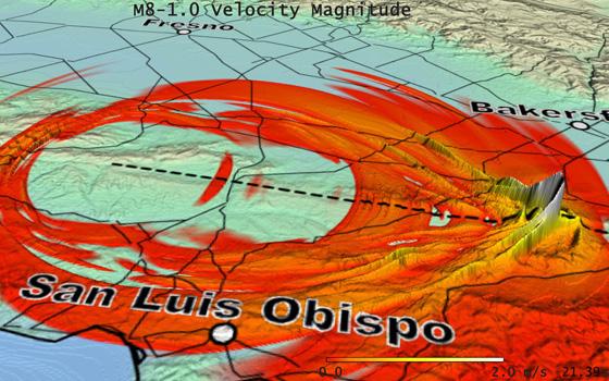
The winner of the People’s Choice award went to a team at the San Diego Supercomputer Center. Using the Supercomputer’s simulation of an 8.0 earthquake along the San Andreas fault, they portrayed the strongest ground motion as the white tips of peaked cones traveling along the leading edge of the earthquake rupture.
Every day, reporters and producers at The World are hard at work bringing you human-centered news from across the globe. But we can’t do it without you. We need your support to ensure we can continue this work for another year.
Make a gift today, and you’ll help us unlock a matching gift of $67,000!
