Global warming is so much worse than we thought. Here’s the chart that proves it
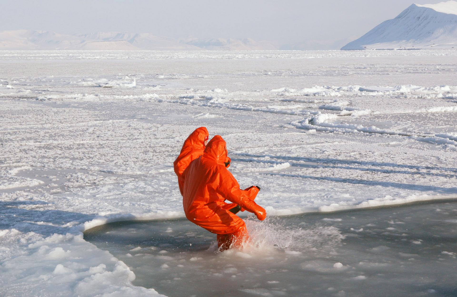
Thawing permafrost around the world is threatening to significantly worsen global warming.
If you've been waiting for the right moment to freak out about the environment, that time is probably now.
The amount of greenhouse gases in the atmosphere reached a record high in 2013, the greatest increase since 1984, according to the World Meteorological Organization (WMO).
That means that the last time the world saw such a high jump in CO2 in the air, Ghostbusters was the top grossing film at the box office, and "Girls Just Wanna Have Fun" was a brand new song. Just a few years later, in 1989, the Montreal Protocol was signed, banning the deadly gases responsible for creating a hole in the Ozone layer — probably not helped by the aereosol sprays we were using to tease the life out of our hair back then.
Three decades on, it looks like we still have not learned our lessons — and experts are warning that we're "running out of time" to battle climate change and curb our carbon dioxide habit.
According to the WMO, there has been a 34 percent increase in "radiative forcing" (the process that causes the planet to warm up), thanks to a rise in greenhouse gases between 1990 and 2013 — 80 percent of that coming from carbon dioxide.
The chart below shows just how bad our greenhouse problem really is. The dotted lines on the chart show the impact of reducing anthropogenic emissions (i.e emissions caused by people) by 80 percent, a goal that is extremely ambitious, given the low priority we give to environmental issues.
![]()
Every day, reporters and producers at The World are hard at work bringing you human-centered news from across the globe. But we can’t do it without you. We need your support to ensure we can continue this work for another year.
Make a gift today, and you’ll help us unlock a matching gift of $67,000!
