Mathematician Oliver Byrne published "The Elements of Euclid" in 1847, updating the ancient geometry text with colorful design language.
If geometry is a language, then Euclid's Elements is something like its grammar textbook.
The 13-volume work, written about 2,400 years ago, lays out geometry's alphabet and dictates the rules for how the letters relate to each other — sort of the math equivalent of "I before E except after C."
But while Euclid was one of the greatest thinkers in the history of mathematics, readability wasn't his thing. His ideas unfold in dense blocks of text with only an occasional diagram.
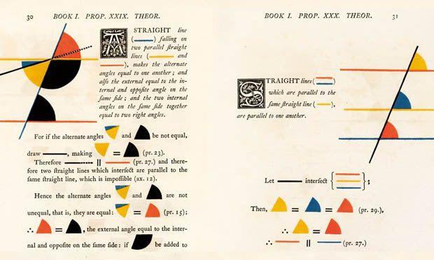
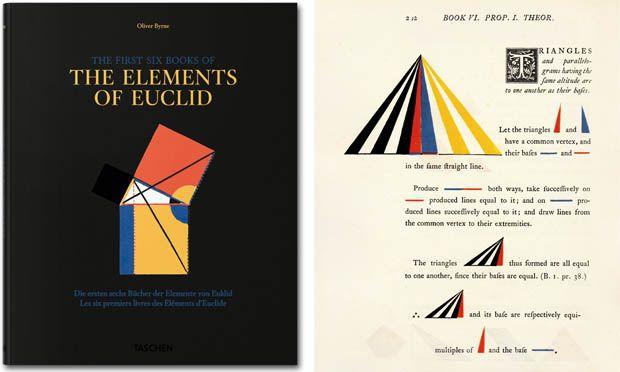
So a couple of thousand years later, Oliver Byrne, a mathematician in England, reimagined the classic text. "The First Six Books of The Elements of Euclid," published in 1847, combines text and woodblock-printed shapes in blue, red, and yellow that elegantly snap together. Byrne replaced words like "circle" or "square" with the shapes they represent.

For the first time, a student could see the math, using both her eyes and her mind to follow the logical march from assumption to proof. It was typography bonded with science and graphic design.
But this gorgeous specimen of Victorian printing didn’t come cheap. Dozens of printing plates had to be meticulously aligned to create the colorful riot of tiny shapes on every page. That made the book hideously expensive— so much so that the printing may have caused its publisher’s bankruptcy.
Adding insult to calamity, critics tore into Byrne’s use of color and symbolism. They called him a “curiosity” and said his geometric systems approached theology.
It wasn't until the early 2000s that Byrne finally had his day. His version of Euclid earned praise from mathematicians and design writers, who called Byrne's work prescient in the way it embodies the Bauhaus and De Stijl movements, which came decades later.
His pages began showing up in books about information design and art, praised by Edward Tufte in the influential book, "Envisioning Information." Steven Heller wrote that he briefly considered mortgaging his house, kids and dog to acquire an original edition, which cost tens of thousands of dollars at the time. Luckily for the kids and the dog, the German publisher Taschen recreated Byrne's masterwork in 2010, and it was reprinted last year.
And yet this admiration from designers might have Byrne rolling over in his grave. In his preface to the book, he said his work had "a greater aim than mere illustration; we do not introduce colours for the purpose of entertainment, or to amuse by certain combinations of tint and form, but to assist the mind in its researches after truth.”
This blog post comes from Sideshow, a new podcast from PRI's SoundWorks network of podcasts. Hosted by Sean Rameswaram, Sideshow looks at the intersection of culture and technology.
