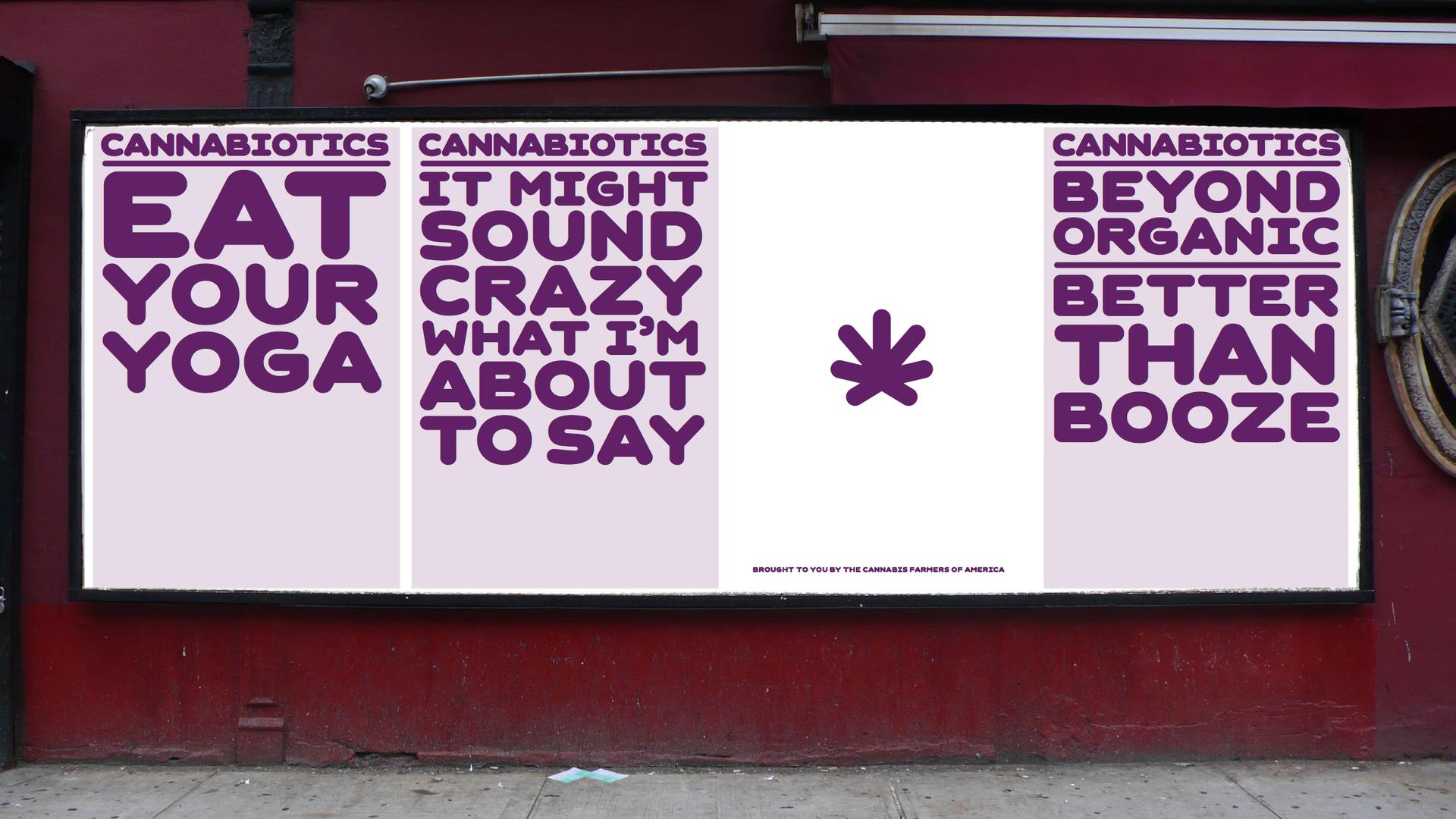
Does marijuana need a rebranding to move into the mainstream?
Recreational marijuana use is now legal in two states. Medical marijuana is legal in another 20. Well-known people as various as Miley Cyrus, Andrew Sullivan and Richard Branson have all come out of the “pot closet.” Pot is gradually going mainstream.
The fact is, most ordinary folks who smoke marijuana don't identify themselves as “stoners.” Getting a little high just feels better to them than kicking back with a glass of wine or a bourbon. If they come out of the pot closet, they want “mainstream marijuana” to look and feel different.
Since seemingly everything in America these days is about marketing, branding or — even sexier — re-branding, what would a rebranding of marijuana look like as part of mainstream culture?
At the invitation of PRI’s Studio 360, a design firm called OCD (The Original Champions of Design) took on this challenge. OCD has created “identity systems” for national brands like the WNBA and the Girl Scouts of America.
Jennifer Kinon and Bobby Martin, the co-founders of OCD, began their design process by doing a “market overview” of the product. The first step was to take a look at the various names and slang terms for marijuana.
“Weed, dope, grass, ganja, reefer — it goes on and on and on,” Kinon says. “And it just gets goofier from there, all the way down to blueberry yum yum, AK-47, Kansas ditch weed — it’s pretty hilarious.”
Next, OCD identified three “audience” categories: “Wellness freaks,” “lean-in moms” and “foodies.”
For wellness freaks, they would present marijuana as the new "organic." “Can you sell it the way you sell a vitamin?” Kinon asks. “You get up in the morning, you take your fish oil, you take your multivite — and you take your pot?”
For lean-in moms, who are always on the lookout for the best product, Kinon asks, with a laugh: “Can we replace that end-of-day glass of wine with the end-of-day glass of pot?”
The way to hook foodies is fairly obvious to anyone familiar with pot’s side effects. “Foodies like to eat,” says Kinon. “Marijuana increases your appetite. So why not incorporate pot into your hors d’oeuvre?”
Kinon says she and Martin began to wonder if a single “identity system” could address all three of these new target audiences. “Are they one universe of user?” Kinon asks. “Or, like chocolate, will it have several different identities? You know, M&Ms going mainstream, Toblerone going high-end. Do we need to start differentiating our types of pot for the audiences that will appreciate them?”
With this in mind, OCD began thinking about graphics. First, they replaced the well-known hemp leaf with a modern-looking purple symbol.
“The new symbol is really a simplified version of the marijuana leaf,” Kinon explains. “It’s completely abstract — it’s seven leaves, different lengths … It looks a bit like a squashed asterisk.”
And it’s not green anymore. It's purple. It’s purple because of the “relaxation cues” associated with that color.
“There are some cues to red wine,” says Martin, “subtle connotations of ‘purple haze,’ and things like that … [It makes a] connection to what people understand marijuana to be as ‘okay.’ But at the same time, we can then move [the association with the symbol] further along so that it starts to represent a different thing.”
OCD also came up with slogans that would be part of the rebranding campaign. For example, “Conscious untensioning for lean-in moms” — inspired by Gwyneth Paltrow’s recent “conscious uncoupling” from her husband, Chris Martin.
“Bringing marijuana to these demographics is all about consciousness,” says Kinon. “That's just in the ether right now, and it's something so applicable to choosing marijuana over alcohol — conscious untensioning … Instead of renaming marijuana, we want to “reposition” the experience. In the same way that in the 90s we did “natural” food, then we started to eat “organic” food, now you can have “cannabiotic” food … You bring the cannabis into the food. Instead of just another leveling of eating, it is another level of eating that brings another level of consciousness.”
Kinon says branding cannabis as an “edible” is the best way to move it into new demographics. “Smoking is out as a way to consume anything,” she maintains.
As with other consumables, it would be important to keep the new cannabiotics safely away from children. Families often have liquor closets or a liquor cabinet; now, those choosing to “consciously untension “ would want to have a “cannabiotics closet,” so their 4-year-olds don’t start eating the Cheese Whiz full of pot.
OCD addressed this danger with another symbol — a circle in a harsh shade of lime green. The graphic is their abstract leaf, now in white, perched above crossed bones.
“It is designating the area where you’re going to store your cannabiotics,” Kinon explains, “and making sure that it’s clearly communicated: 'Eat this brownie, not that brownie.' [It’s about] developing a clear marking, playing off of that poison symbol, that this isn't for regular consumption. You need to eat this responsibly.”
Kinon likens OCD's “identity system” to the Got Milk campaign or the Drink Your Orange Juice in the morning idea. “It's all about finding that time and place to use the right substance,” she says.
This story is based on an interview by PRI's Studio 360 with Kurt Andersen, where you'll find other coverage of popular culture, design and the arts.
