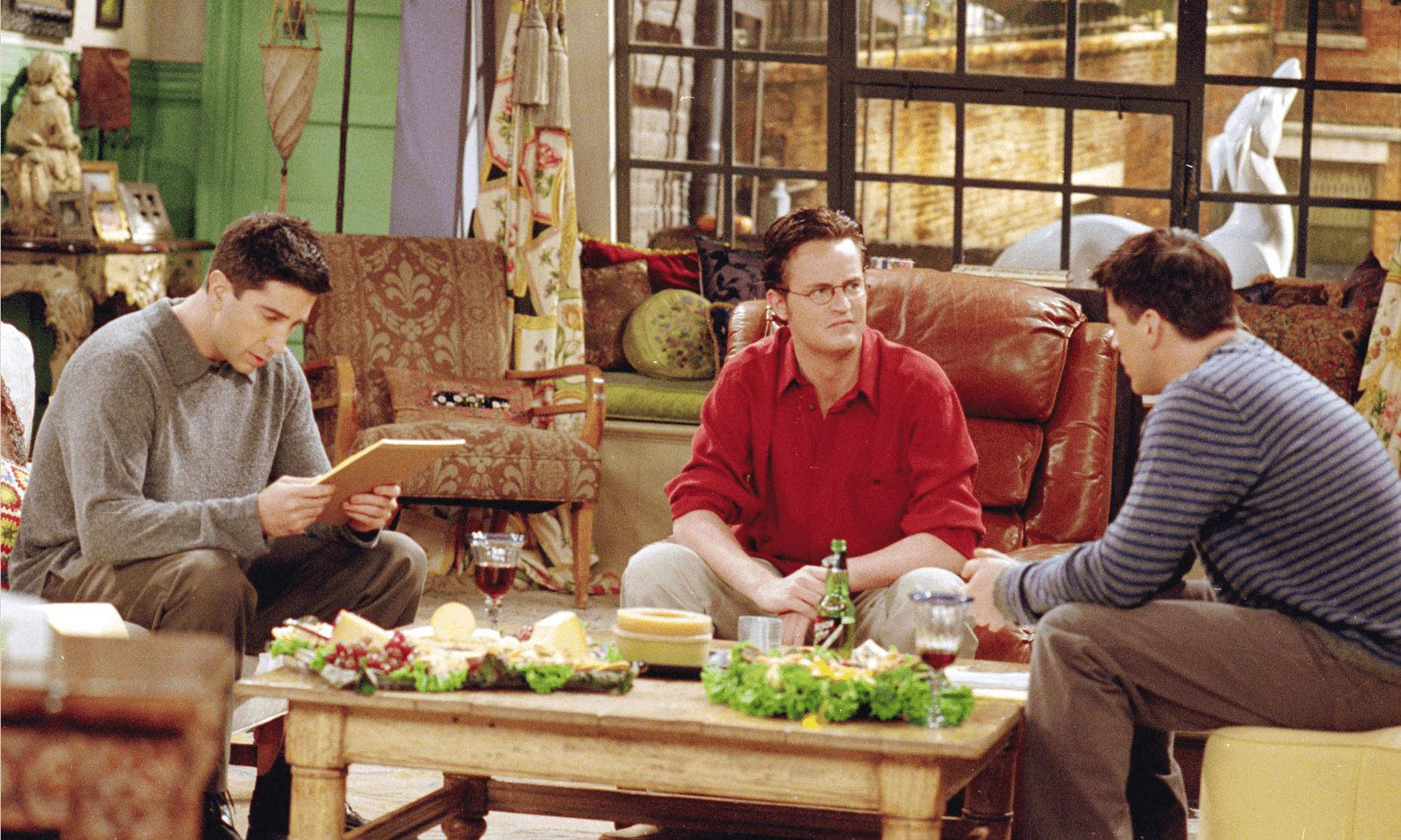
Can a Room Be Funny? Sitcom Set Designers Think So
Glenda Rovelloknew she wanted to be a set designer when she was young, but she wasn’t sure if she wanted to go into film or theater. Then she saw an episode of Frasier, and was fascinated — not by the characters or the jokes, but by the set. The furniture was modern but classy. The architecture was full of curves. And the big view of Seattle out the window didn’t look fake.
“You’ll notice in a lot of sets they don’t have that much glass, and that has to do with a fearless production designer and the cinematographer. That was really courageous on both their parts,” she says.
A production designer has to make you believe there’s a whole world beyond a room with three walls and no ceiling. But at the same time, the set has to feel so cozy, you’re happy to watch the characters move around in it for years. So when Rovello starts working on a new sitcom, she thinks about how to create a sense of depth. A veteran set designer once told her to think of sets as Swiss cheese. That’s how she designed the diner on 2 Broke Girls— so the characters are weaving around stand-alone set pieces. She likes to add extra doors and little spaces for the cast and writers to discover over the years.
“People call it business — like, ‘Give them business camera right, give them business upstage.’ It’s being able to allow action in different places so it’s not so monotonous that they’re always going to the sofa because there’s nowhere else to go.”
Set designer John Shaffneragrees. He designed the set for Friends. Shaffner is interested in “keeping the set alive” — making sure the same props aren’t there week after week. He says, “I always think back to one sitcom in particular, Happy Days, where it seemed like the ketchup and mustard were glued to the tabletop and nothing ever changed!”
While most Americans watched Happy Dayson fuzzy screens with antenna reception, high-definition flat screen TVs pick up a lot more detail. According to Rovello, set designers have responded by using more real materials — like a real marble countertop in a cupcake shop, instead of a painted board. Computer graphics can also make traditional sitcom sets feel more real. Production designers use green screens as backdrops, and then add the backgrounds digitally in post-production. So if the characters are at a park, we can see people playing deep in the background.
But there’s another reason why production designers are trying to innovate. Sitcoms (a.k.a. multi-camera comedies) have serious competition from single-camera comedies like Modern Family, The Middleor Silicon Valley, which aren’t filmed before a live studio audience. When single-camera comedies became popular ten years ago, the conventional wisdom was that sitcoms like Friends would become a relic. But instead, the traditional sitcom has thrived. That’s partly because we crave the comfort of those sets, which have to do a lot more to evoke a whole world.
“I think the greatest thing about multi-camera comedies is it gives you permission to relax and laugh and enjoy it,” says Shaffner. “I think it’s easier to watch.”
So TV sitcom set designers try to capture the increasing chaos of our daily lives in the 21st century — while still bringing viewers back to dependable, comfortable spaces where all of life’s problems can be solved in less than 30 minutes.
