A Brazilian student mapped out Rio’s racial segregation. What he found was startling
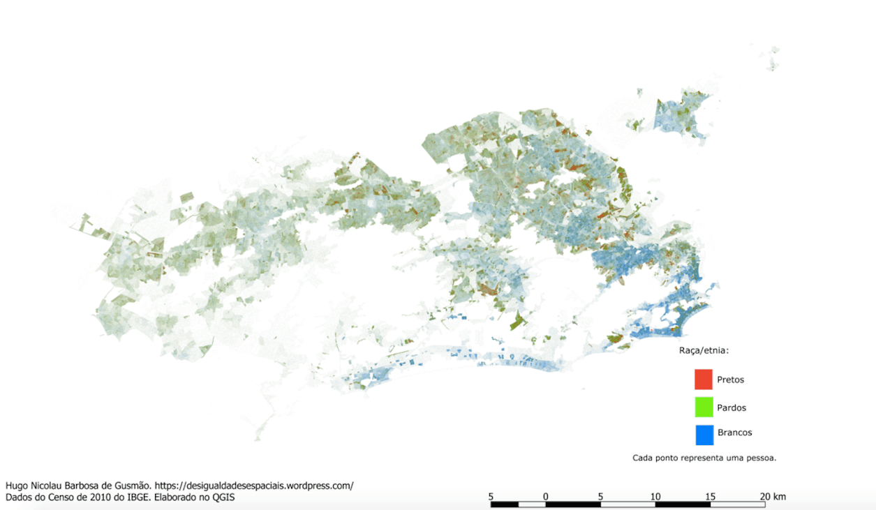
Rio de Janeiro's demographics mapped out by race.
Update: On Wednesday, the same Brazilian geography student created another map, this time giving a citywide look at Rio de Janeiro's racial breakdown.
RIO DE JANEIRO, Brazil — Hugo NicolauBarbosa de Gusmão, a 29-year-old geography student from Sao Paulo, got fired up watching the news from Rio de Janeiro.
Following reports that young black men were being effectively barred from accessing Rio’s fanciest beaches, Barbosa went online to find out more about the racial makeup of Brazil’s second-largest city.
Barbosa said he had seen richly detailed maps showing the racial segregation in Chicago and other cities in the United States, but he said he could find no such maps of Brazilian cities online.
So he decided to make his own.
After tabulating 2010 census data from Brazil’s federal statistics agency, the most recent available, Barbosa created a series of maps using free open-source software. What he found both confirmed what he suspected and surprised him.
“The Zona Sul [South Zone] of Rio is about 80 percent white — 80 percent!” Barbosa said. “I knew it would be high, but I didn’t think it would be that stark.”
According to Barbosa’s research, one neighborhood, Lagoas, was almost 90 percent white.
Nationwide, the share of Brazilians who identified as white in the census was only 48 percent.
More from GlobalPost: #BlackLivesMatter has gone global. And Brazil needs it — badly
For further confirmation, GlobalPost showed the study to a senior demographer at Brazil’s National School of Statistical Sciences. He said it looks accurate and estimated that little has changed since that census.
Barbosa posted his maps on a new blog and Facebook, where they were shared hundreds of times.
The Brazilian census has five (broad and oft-criticized) categories for race: “branco,” Portuguese for white; “pardo,” literally brown for mixed-race with African descent; “preto,” or black; “amarelos” or yellow (yes, unbelievably) for people of Asian descent; and “indigeno” for indigenous peoples.
Approximately 50 percent of the country's population identified as either pardo or preto (both also referred to as Afro-Brazilian). About half of Rio's population did as well.
Yet, in the city's most prestigious South Zone neighborhoods, it’s clear that whites are a vast majority along the beaches, where real estate prices are highest, and that other racial groups are a minority and are clustered together in certain neighborhoods:
Barbosa also produced three maps showing each racial group individually in the South Zone.
This one shows where people who identify as preto (black) live. As you can see, the population is generally grouped in clusters inland away from the beach:
And this one shows where people who identify as pardo (mixed-race) live:
Lastly, here is just the population that identifies as white. You'll notice that 80 percent concentration in the South Zone we were talking about:
Barbosa said he spent a lot of time putting together the maps, and hopes they add to a growing conversation in Brazil about race, disparity and criminal justice issues. As GlobalPost recently reported, young black men are killed in overwhelmingly disproportionate numbers by police officers in Rio. Barbosa echoed activists who said race is seldom discussed by Brazil’s policy makers.
“I wanted these maps to be available because here in Brazil there’s a lot of talk about how there isn’t any racism,” Barbosa said. “That’s wrong, and I think these maps are a good visualization of that.”
Jose Eustaquio Alves, a demographer and professor at Brazil’s National School of Statistical Sciences, said most Brazilian cities are similarly segregated.
What’s unusual about Rio, he said, is that non-white and white neighborhoods abut each other.
There are “favelas” — poor, underdeveloped neighborhoods where residents are predominantly non-white — right alongside some of the most expensive real estate in Brazil. Typically, he said, favelas are out in the suburbs of Brazilian cities, where land is cheap and work commutes can be very long.
Alves said Barbosa’s mapping work has been done previously by other demographers, but that the accessibility of data online combined with free mapping software mean that anybody can now create sophisticated maps to illustrate demographic trends.
“We used to have to pay for that data,” he said. “Now everything’s free.”
The story you just read is accessible and free to all because thousands of listeners and readers contribute to our nonprofit newsroom. We go deep to bring you the human-centered international reporting that you know you can trust. To do this work and to do it well, we rely on the support of our listeners. If you appreciated our coverage this year, if there was a story that made you pause or a song that moved you, would you consider making a gift to sustain our work through 2024 and beyond?
