How a typeface can save money and lives
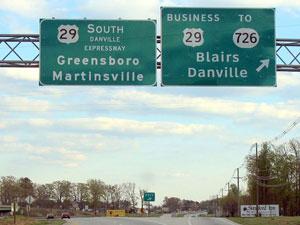
Photo of a highway sign using the Clearview typeface.
This story was originally covered by PRI’s Studio 360. For more, listen to the audio above.
The federal highway system was built with the military in mind. The roads were designed to mobilize the military during the cold war, and drivers were more of an afterthought. Aesthetic concerns weren’t given much thought.
The font used in the signs — Highway Gothic, series E-Modified — was invented before modern computers and typographical tools. “The astonishing thing is that that has lived for 58 years,” graphic designer Don Meeker told PRI’s Studio 30. “The road-scape, however, has become much much more complex.”
Two-lane highways have been replaced by four-lane freeways. The sides of highways are now littered with commercial signs and other clutter. “The competition for your eye has become greater,” according to Meeker, “yet the side of the road where you place signs has not become wider.”
In the late 80s, the federal government became aware that the driving population was getting older. They were also aware of these new high-brightness materials and the halation effect — where letters could turn into big glares due to too much white on the signs. In essence, the old typeface wasn’t working.
Studies were released saying that the typeface should be enlarged by 20 percent. But as Meeker pointed out, making the typeface 20 percent larger would have meant making the signs 50 percent bigger, which would have cost billions.
“We looked at the typefaces and realized finally that we were going to have to start from scratch,” Meeker says. “This is something that we’d never done before.”
The typeface they invented came to be known as Clearview. “Different typefaces have different voices. They can be delicate, they can shout,” Meeker told Studio 360. “In this case, with Clearview, the voice of it is as the invisible umpire. It has to make a good call.”
The Clearview typeface hasn’t just saved the federal government money, according to Meeker. “This 20 percent gain in legibility for the same size sign, has saved many lives.”
PRI’s Peabody Award-winning “Studio 360 with Kurt Andersen” from WNYC is public radio’s smart and surprising guide to what’s happening in pop culture and the arts. Each week, Kurt Andersen introduces you to the people who are creating and shaping our culture. Life is busy — so let “Studio 360” steer you to the must-see movie this weekend, the next book for your nightstand, or the song that will change your life.
