New Home Brings Barnes Collection to Full Radiance
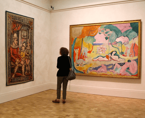
The Barnes Foundation restored its world-famous collection of Impressionist paintings to public view last weekend. The new galleries are exact re-creations of the original galleries in Lower Merion, but you’ve never seen the paintings like this before. The light is completely different.
In the Merion galleries, the paintings which had the misfortune to be placed in corners or hallways were relegated to permanent darkness. The main source of light — daylight — was diffused through yellow blinds.
“If you were in any of the galleries, apart from the main gallery, you were suffused with yellow light, which is really bad for Cezanne,” said Barnes Foundation president Derek Gillman. “When you have the greatest Cezanne collection in the world, the light was terrible.”
The new galleries have state-of-the-art lighting, revealing the paintings as never before. It’s one of the ways the new building enhances the original vision of Dr. Albert Barnes.
The architects — Tod Williams and Billie Tsien — faced the challenge of maintaining the homey, domestic feel of the original Merion building in a much larger, civic-minded construction along the Parkway — itself a grand boulevard in the tradition of Champs-lyses.

The central atrium is the showstopper. A soaring ceiling with a cocked peak gently bounces sunlight down upon an expansive waiting area. The grandeur is softened with warm touches: mahogany staircases, knotty tilework based on African tapestry in the ticketing lobby, and a hardwood floor populated with long couches. (See a slideshow below.)
“We see people walk in, and they want to touch things,” said Aileen Roberts, chair of the Barnes’ building committee. “The wood floor has been oiled. It doesn’t have a plastic feel to it.”
Architect Tod Williams relaxed into one of those couches of his own design, which are covered in woven upholstery inspired by Senegalese fabric (a nod to the Barnes’ African art collection) to point out how his building does not operate like a conventional museum.
“You can go to Philadelphia Museum of Art — try the vestibule there, with the information desk. Or at MOMA with the mosh pit that occurs there,” said Williams. “We really wanted to make sure this felt domestic. Even if it’s monumental, it’s idiosyncratic. We wanted it to feel personal.”
The building and its landscaping work in tandem to allow people to forget they are on the Parkway. The experience starts on the garden paths wending around fountains and reflecting pools, through a copse of red maple trees. “One of the things about Chinese and Japanese pavilions is that they realized red goes well with green,” said landscape architect Laurie Olin. “With the limestone of the building, it’s just a knockout. And the blue of the sky.”
Visitors then enter the ticketing lobby, then around a corner and across the atrium with a terrace on one end and an auxiliary gallery on the other, through a pair of enormous brass doors into the main event — the galleries with the world-famous collection of paintings. The Parkway, about 50 feet away, at this point seems very distant.
“Everything that we’ve done, we’ve really started with Dr. Barnes and the collection,” said Roberts, calling Barnes a “phantom client.”
“It’s really his vision that inspired us. It’s about learning to see art, and learning to see art in every day. The only way to do that would be to replicate the galleries,” said Roberts.
The individual rooms of the galleries may have been replicated, but the building pulls them apart to fit classrooms and a glassed-in green space between. The salon-style arrangement of paintings in dense, perfectly symmetric clusters can quickly cause visual fatigue; the art-neutral areas between the galleries act as aesthetic breathing spaces.
The fact that the $150 million building should exist at all still rankles many people who believed the collection should never have left the leafy Latch’s Lane building in Lower Merion.
“From the moment we got this assignment people said, ‘Should you really be taking on this thing?'” said Williams. “We believed it would be right, and wanted to respect the collection in such a way to bring to the collection the spectrum of the kinds of people that Dr. Barnes wanted to touch.”
“Would Dr. Barnes be happy?” asked Billie Tsien, Williams’ partner in life and work. “He doesn’t seem to be — from what I read about him — a person to ever be particularly happy. But I think he would have to have a secret smile if he could see the larger diversity of people that will be able to enjoy his collection.”
Slideshow: Inside the New Barnes
We want to hear your feedback so we can keep improving our website, theworld.org. Please fill out this quick survey and let us know your thoughts (your answers will be anonymous). Thanks for your time!
