Design for the Real (Japanese) World
We (Americans) love to talk about how Japanese design – sushi, origami, bonsai trees – is amazing for its beauty and detail. And yes, those things are there. But as I’ve been walking the streets of Tokyo, a few things have caught my eye that are much more utilitarian.
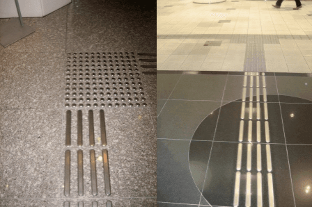
When we first got to our hotel, I noticed these raised metal shapes on the floor. It took another day of sleep – and seeing them all over the place – to realize what they were for.The ones pictured here lead from the hotel elevator to the thoroughfare outside the hotel. Take the T to the left, it goes to the mall, take it to the right, it goes to the street. When I realized they were pathways, I figured out that they are for the blind. I started seeing them all over the city, along every sidewalk leading to bus stops and subway stations.
 I have yet to see a blind person actually walking on them, but it’s impressive that they exist. I haven’t seen anything similar in New York or London or other major cities that I’ve been to. In fact, whenever I see someone who’s blind walking the streets of New York I am amazed that they can get around. Would NYC ever implement these kind of pathways? (Given that our subway announcements are often incomprehensible, probably not.) The traffic crossings here also ‘chirp’ – another thing lacking from New York, though I have heard those in Europe.
On another transportation note, I’ve seen a lot of bikes, which usually seem to be parked in clusters unattached to racks. So, I thought, without locks. On closer inspection, I noticed these:
You use a key to activate the lock around the wheel. Of course this would never fly in New York – someone would inevitably take the whole bike. But it’s cool to see a lock that comes attached to the bike – much more convenient than schlepping a chain or a u-lock.
Now here’s something that our WNYC colleague Ellen Horne told me to look out for:
Yep, that’s a manhole cover. There you go: Japanese utility and beauty all-in-one.
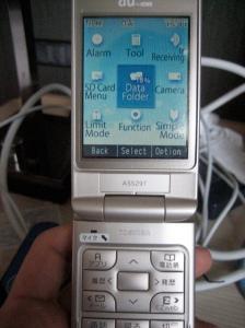
Aha – but not everything is ingenious here. I can officially say that our cell phone design sucks – confirmed by our Japanese colleagues. It’s the most counter-intuitive interface. And it’s in English! (What are ‘simple’ ‘limit’ and ‘manner’ modes?) Maybe by the time we leave I’ll have figured it out.
– Leital Molad


