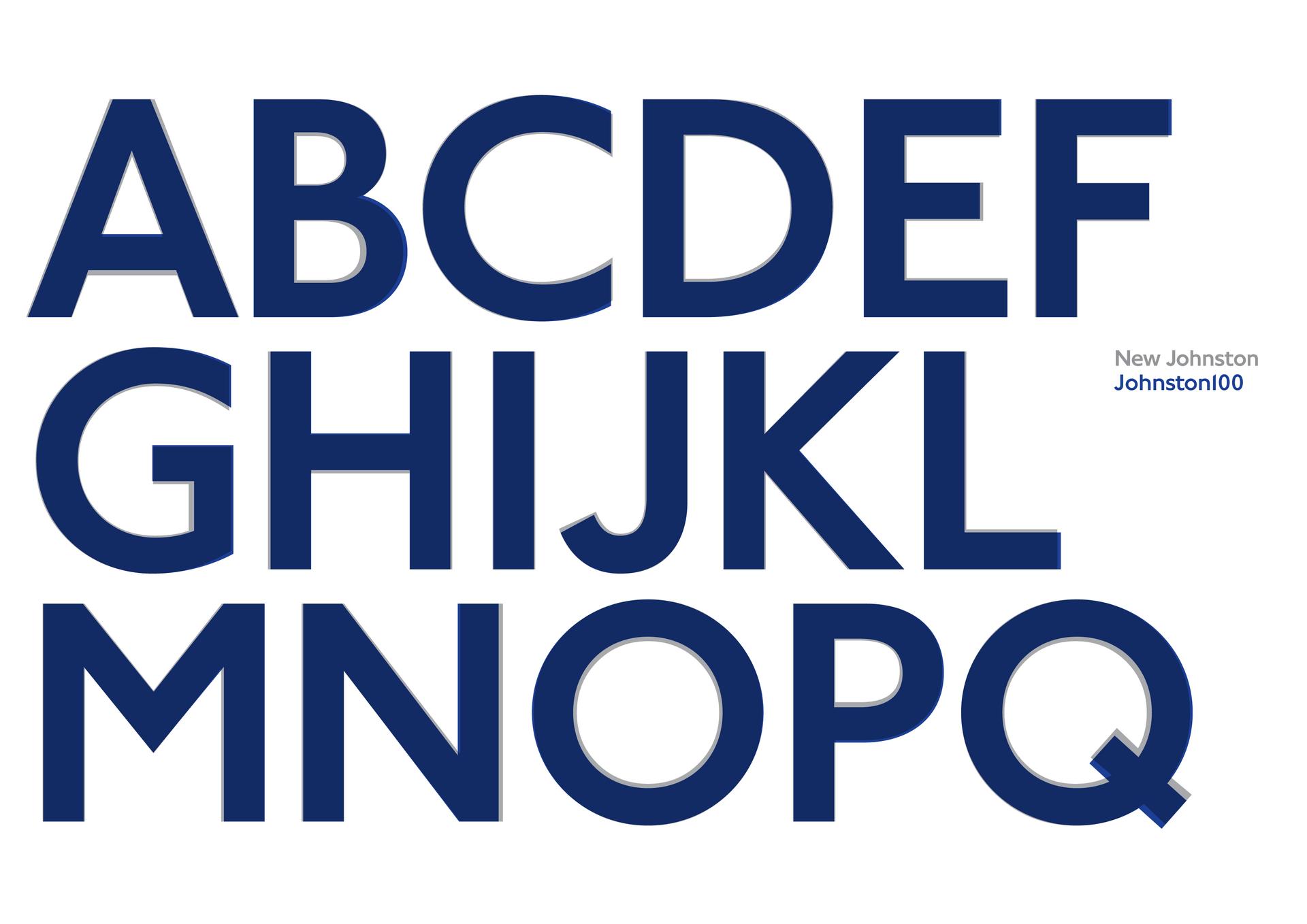
London welcomes Johnston100, the new typeface of the London Undergound.
Despite Britain’s recent identity crisis, changes to London’s visual identity have some feeling a bit more optimistic.
The London Underground’s iconic typeface is getting a makeover.
Johnston100 hits subway stations this month, marking the slow goodbye of Johnston, the font that has guided commuters through the tube for the last century.
Recognizable by Londoners and non-Londoners alike, Johnston was a typographic first when it was originally designed for the London Underground by Edward Johnston in 1915.
“It was a breakthrough I think in design communication,” says Nadine Chahine of Monotype, the type foundry commissioned for the project by Transport for London. “It was the first of its kind in terms of this blend of geometry and humanist design, an unbelievable achievement in terms of design skill and vision.”
Chahine points to Johnston’s consistent use as a major indicator of the font’s success. There’s a reason why the typeface has survived this long — It works.
While Johnston has served its purpose in getting passengers from point A to point B, the font was in need of a digital update. Some of Johnston100’s features include the hashtag and @ symbols — and a new hairline weight designed for better readability on screens and smartphones.

Despite these modern touches, Chahine aimed to bring back some of Johnston’s original “soul” that had been lost over the years. For Chahine and type designer Malou Verlomme, this process involved detailed research into the font’s original design intentions.
“In a way it’s a change, but a change back to the roots,” she says. “While of course keeping in mind the current requirements of contemporary communication.”
Some of these changes are apparent in the width of the font, as well as individual letters like the M, the N and the H. Chahine says the lowercase G is a giveaway.
For the average commuter, the changes in Johnston100 will probably seem subtle.
Some might not notice them at all.
However, Chahine says these intricacies haven’t stopped Londoners from expressing their excitement. There’s even been a hashtag.
“The project has been heavily covered here in the UK and people have been very positive with their feedback,” says Chahine. “Many people are interested within the design world and also outside of the design world.”
Riders can expect to see the full extent of Johnston100 with the opening of the new Elizabeth line in 2018, but until then, tube station signage will make a gradual shift toward using the new typeface.
Like many Londoners, Chahine is thrilled with the final product.
London’s got a new look, and it looks good.
