Public radio’s longest-running daily global news program.
©2026 The World from PRX
PRX is a 501(c)(3) organization recognized by the IRS: #263347402.
A collaboration between the UN and Google presents information on the state of the world’s poverty and development in graphics
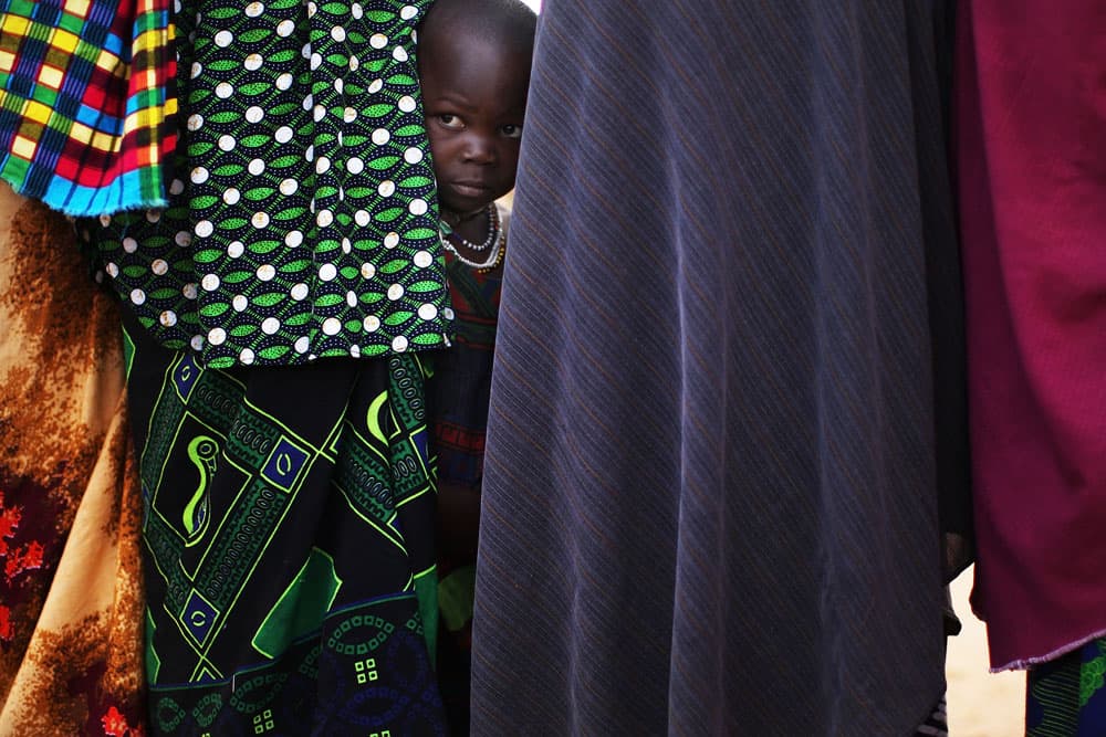
Among the world’s poorest: Dadaab in northern Kenya is home to hundreds of thousands of refugees who have fled decades of war in Somalia.
Working with Google the United Nations Development Program (UNDP) has come up with an ingenious tool for plotting and understanding human development indicators across the world.
Using Google Public Date Explorer technology it is now possible to see UNDP’s Human Development Index in graphics.
UNDP’s annual Human Development Report essentially calculates the extent of misery around the world using indicators such as life expectancy, population growth, number of refugees, access to healthcare and education, GDP and so on to come up with a league table of development and poverty.
The report is a weighty tome and rarely seen or used by people outside specialist fields interested in such things but the new online platform should change that.
“Making this information more accessible through Google gives Internet users everywhere a compelling new way to see the trends and patterns in human development today and over time,” said Jeni Klugman, director of UNDP’s Human Development Report office. “This brings the [Human Development Index] graphically to life.”