New Year’s Resolution: Finding the Tools
Garman Herigstad resolved to hand letter the entire Book of Proverbs this year. He has already made an ambitious start, and this April Herigstad has started experimenting with some new materials.
One of my many goals for the Proverbs Project is to experiment with new lettering tools.Different pens produce different sizes, as well as different styles, of lettering — from the pointedcopperplate style nibs to the wide chisel brushes.I’m long overdue to upgrade my work computer. I had filled out the online order at the AppleStore, and was ready to click the purchase button. But, I thought, better to use that money forexpanding my lettering tool-set.
Craftsmanship
I have to admit that using software and working with calligraphy pens are both crafts. It’seasy to get something basic with either tool, but to get something great out of them, thebeauty of the form, requires both technical skill and artist skills. Perhaps that’s a definition ofcraftsmanship.One problem in the visual effects business was the investors often had the idea that thecomputer did all the work. My first computer animation job title was “operator,” not animatoror artist. I think that title came more or less from the company that was selling theequipment. Easier to sell an expensive system if you just need an “operator.” I spent hourslearning the technical aspects, as well as the creative insights into motion, color, andcomposition in a 3-D space.
Part of my beef with VFX is the transient nature of technology. Masters of a technologyquickly become obsolete when the technology is scuttled. I’m not sure if there’s a runningversion of the Bosch FGS 4000 animation computer which I stated with back in 1986. It’shard to show off skills if the thing won’t boot.
The calligraphy tools I left back in the 1970s and early 80s were patiently waiting for me in abox. They work the same way they did 30 years ago. No upgrades required. Even some ofthe watercolors I had were still useable.Not so with computers. Old timers are not revered, but labeled as dinosaurs. There are nomeans to pick up the puck and dazzle the youngsters with a display of “this is the way weused to do it.”I’m not crying over this. Just whining.
New Toys
I’m taking two decade-steps back, technically, to go three steps forward, creatively.I’ll show you the new toys I’m playing with now. Some of them have been around forhundreds of years and some benefit from manufacturing innovations. The nice thing is thatthey all will boot up just fine in another thirty years.
One very cool new calligraphy technology is the Pilot Parallel Pen, which has a wonderfulwide metal edge, available in four widths. There’s no need to constantly dip the nib into abottle, as with other metal nib pens.
They are great for practice, and for some kinds of finished works. The types of inks that workwell are more limited than with a dipped nib. No gouache and there’s a need to be carefulwith permanent inks.I expect I’ll sacrifice at least one of these pens while I experiment with different kinds of ink byclogging the pen so that it’s no longer cleanable. Sacrifice of tools and materials is part of mylearning process.
Ruling pens seems to be a clumsy grouping of tools with non-traditional chisel edges. And Ithink there’s probably some circles which will debate long into the night over what a rulingpen might actually be.
One style (not pictured here) is the long, screw adjusted inking tool that comes with aprotractor set. These are good for modern expressive calligraphy and show card writing.
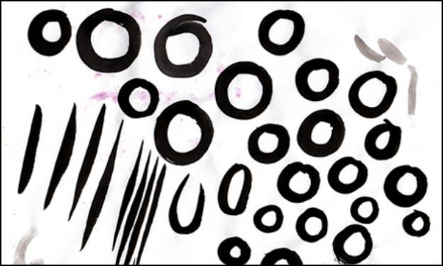
I’m finally getting used to large lettering, letters over 3″ tall. There’s a lot more arm motioninvolved, plus the battle with table space and more ink that’s slower to dry. For the curved style ruling pen , variations come from changing the angle of the pen whilewriting, and sliding the portion of the nib used.
Until a year ago, I never liked the idea of a fountain pen. I’m not exactly sure why. Theyseemed to be an outdated technology. They were a status symbol, yet would leak ink intoyour Armani suit pocket.
As I started my new era of calligraphy in 2015, I discovered that older fountain pens were very flexible and could produce the varying stroke of copperplate pens. Most fountain pens todayare not flexible, they just look grand. I jumped right in, and bought a wide tip and narrow tipflexible fountain pen. There’s no fancy case, butthe pens were still expensive. I also boughtsome of the traditional copperplate nibs, which are extremely flexible.
It’s a challenge for me to apply and release the pressure at the right time to get the thicks andthins of the stroke. A very different technique from the wide chisel tip metal pen. With 900possible proverbs, there’s lots of time for me to practice.
The wide chisel edge brush is perhaps the grand master of all calligraphy tools. TheDavenport Iowa calligrapher Father Edward Catichprovedthat the serifs of the Roman lettersin Trajan’s column came from the brush and not the chisel. The letters were written firstwith the brush before carving into the stone.
The Roman letters are bold, yet elegant. There’s no room to hide any errors with thelong straight strokes and smooth undulating curves.The brush has the same benefit as the wide metal calligraphy nib, creating the thicks andthins by holding the brush at a steady angle. Because the brush is responsive to pressure, thestrokes can be make wider or thinner, and twisting the brush has less resistance and splatterthan a metal nib.
My version of Isaiah the prophet’s quote to “hammer their swords into plowshares and theirspears into pruning hooks,” is my buying lettering pens instead of a new computer.I bought a big selection ranging from 1/8-inch wide to 1-inch wide. With some good-quality Japanese ink, I am very impressed with the quality of letter I can get out of even the1/8-inch wide brush. There’s a clarity and level of detail I never dreamed of getting with themetal pen. After working with it for a few minutes I had the thought of never going back.
There’s still lots of work for me to do. The above exercise shows me learning to twist the brushwhile pulling the stroke. Yes, it looks clumsy. There are hours and hours of practice waitingbetween me and a beautiful finished piece.
Perhaps the coolest tool, new to me, with unexpected qualities, is the water brush. A syntheticbrush, pointed or chisel, with a water reservoir in the handle. This can be filled with ink insteadof water but I’m trying water for now. The handle is very flexible and pressure applied willforce the water out the brush.This allows for a couple of techniques. One is writing with water, then dripping in ink andletting it flow into the shapes of the letters. The other is to dip the water-wet brush into inkand letter with a combination of ink and water. With pressure, the fluid release can beoverloaded for a very wet letter.
These water brushes are not expensive and fun to play with. Paper is one challenge as somepapers react better to being overloaded. I was practicing on inexpensive printer paper, andthe ink bled wider than my original strokes.
Using the water brush and blending the ink after the letters are written is a very cool technique. Myfirst memory of this is seeing works done by Timothy Botts back in the ’70s. I had tried a bit ofthat with my 3/4-inch brush and Dr. Martins dyes.
I inherited a set of Kodak photo retouching dyes from my parent’s photography business. Mymom wouldn’t be using them again, and when I visited on her 90th birthday she said I couldtake them with me. They had dried and I thought their usefulness had expired, but I’m game toexperiment. The colors are CMYK: cyan, magenta, yellow and black, with a neutral, red, blue,orange and brown. They reconstituted quickly and are extremely concentrated and vivid. I’msure they are a bit on the toxic side too, so I’m wearing rubber gloves.They are fantastic for lettering and watercolor. Mixing CMYK is a huge challenge in itself, withany “print” color theoretically possible. A nice thing is they blend amazingly well into the wettrail left by the water brush.
For very large letters, I’ve added foam brushes and Molotow “urban” markers to my collection.There are on my list of tools to try, as they require a lot of space, the side of a building orsubway car.”Urban” is code for “graffiti.” Molotow products became popular in Europe where graffiti is at ahigh level. They have a sturdy nib and are great at writing large letters with permanent ink. Ihave a 60mm very wide pen and have used that on large painters drop cloth paper in largerolls 30″ wide by 60-feet.I’ve been looking forward to summer when I can work outside on large paper. Perhaps there’sa world’s record for ‘longest hand written passage of biblical proportions’ waiting for me!
Technique Over Content
So far I’ve been addressing the technical aspects of getting back into calligraphy. There’s still the layout, design and illustrative aspects to tackle.There have been significant ways which Proverbs have impacted my life and actions. This is abook of wisdom. The young can read itand disregard the advice. The elders can lookback and concur with a smile or a sigh.So far, my calligraphy project has made it to Proverbs chapter six. I’ve spent a lot of timelearning new technique rather than just plowing though the verses to meet a quota.I have to admit, I wish I’d paid more attention to some of those warnings twenty some yearsago. There was a pile of poop in my life I might have otherwise avoided if I heeded thatwisdom.
I’m still learning. More than calligraphy.