Visualizing preventable child deaths around the world
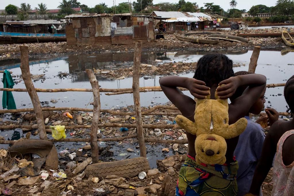
Children play silently as danger lurks in the waters in the slums of Kroo Bay on May 3, 2010 in Freetown, Sierra Leone. Diarrhea kills more young children each year than HIV/AIDS, tuberculosis and malaria combined around the world.
Last year, the PULSE team worked closely with the Pulitzer Center on Crisis Reporting to produce an interactive map of the number of children who die each year before age 5 from preventable causes such as diarrhea and pneumonia.
The dynamic infographic anchored our Special Report, “Step by Step: The path to ending child mortality” in which we documented the successes that have been made in ending preventable child deaths since 1990 as well as the challenges that still lie ahead.
This week the Pulitzer Center published “Child Lives,” a stunning interactive map that includes data from 2012 that was not yet available at the time of our publication.
Of particular interest are the charts of individual countries that showcase their progress reducing child mortality.
The global health community has made great strides in recent decades – reducing child mortality from nearly 13 million in 1990 to nearly 7 million in 2012. But the magnitude of the problem is still great, particularly in Southeast Asia and Sub-Saharan Africa.
Later this month, the United States Agency for International Development and its partners will celebrate the second anniversary of “Child Survival: A Call to Action” – the launch of a global campaign to accelerate reductions in child mortality across the globe. As the Pulitzer team notes, less than two years shy of the global 2015 deadline, “Few developing countries are on target to meet Millennium Development Goals to reduce child mortality.”
More from GlobalPost: Step by Step: The path to ending child mortality