Bad Design Makes Twitter Angry
You can’t toss an empty bourbon bottle in Louisville, Kentucky, without hitting some example of excellent graphic design — from fading ghost signs on old brick walls to new businesses with great logos.
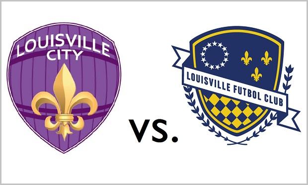
Which is maybe why, when the news broke this week that the city would be home to a new professional soccer team, the Louisville City Football Club, so much of the attention focused on the logo: a gold fleur-de-lis over a purple bourbon barrel (see above).
Why purple? It’s the color you get when you mix red (the color of the University of Louisville Cardinals) and blue (their arch-rivals, the University of Kentucky Wildcats), the Club explained helpfully. Massimo Vignelli would not be amused.
Twitter quickly decided that the graphic identity of the new team needed, ahem, some work.
Then some local graphic designers stepped in, offering their own redesigns:
So, @loucityfc, these are my designs. I’ll be submitting them when we can! #LCFClogo #LouCityFC pic.twitter.com/xYCspVT3bY
— Arsenal Kentucky (@Arsenal_KY) June 4, 2014
An entire portfolio of branding ideas turned up from local ad agency strADegy, with team names like the Sternwheelers and the Lads:

Responding to the criticism, one of the team’s owners appeared to double down on the original logo. “If we live with that logo for a year, I’m not going to think it’s the end of the world,” architect Wayne Estopinal told the Courier-Journal. But by the time of the official announcement at a press conference yesterday afternoon, the story had changed. Estopinal said the team would hold a design contest to choose a new logo.
Design nerds of the Internet: 1.
Bad logos: nil.